The situation
LusOasis is a young brand with four vegan, keto, gluten-free baking products. Business goals: 1,000 newsletter subscriptions in six months, $100K in revenue, and a transition away from Amazon to direct-to-brand purchasing.
The site had three problems: too much content on the homepage to digest, an unfocused brand message users couldn't connect to, and a checkout journey that lost shoppers before they could buy.
Discovery
Business analysis with the client + secondary research on plant-based consumer trends + a competitive/comparative analysis split across 17+ sources, with a feature inventory and pluses/deltas pass.
Four 1:1 user interviews over Zoom explored health journeys, what drives healthy-food purchasing decisions, brand-loyalty triggers, and online-shopping expectations for direct-to-brand sites.
- Customers want honesty and clarity about food sourcing
- Reviews and product descriptions drive purchase decisions
- Bad past experiences make trust the bottleneck
- Community connection sustains brand loyalty
Design direction
Persona "Health Conscious Heidi" — vegan two years, burned by inconsistent brands, willing to keep trying because every few brands she finds a real gem.
The redesign made it easy to explore the brand story, understand the nutritional logic behind ingredients, and find recipes that turn the mix into something people actually want to bake.
How I worked
Three weeks is short. The temptation in a short engagement is to skip discovery and start designing — and that's how short engagements produce pretty homepages that don't move revenue.
I held the line on a real discovery week: business analysis with the founder to lock the actual goals (1,000 subs, $100K, off Amazon), a competitive audit across 17+ direct and adjacent brands looking specifically at what built or broke trust in the first ten seconds, and four user interviews focused on the moment of purchase decision rather than general food preferences.
Week two was synthesis and direction; week three was design and handoff. The redesign decisions came from the discovery, not from my taste.
A three-week engagement still earns a real discovery week. Skipping it is how short engagements ship pretty homepages that don't move revenue.
Decisions that came out of the research
Three concrete calls reshaped the site:
- Cut the homepage roughly in half — the interview signal was unambiguous that new visitors bounced before reaching the recipes section that actually converted.
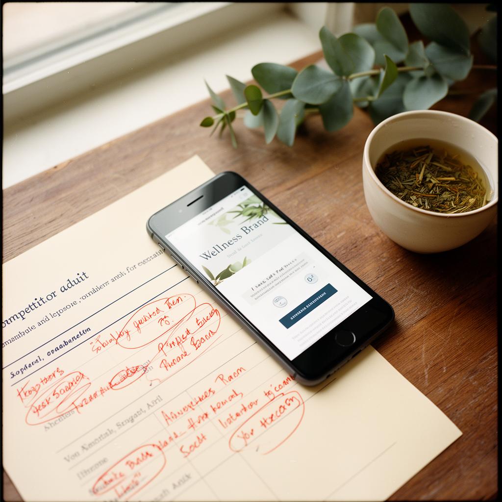
- Lead with ingredient transparency, not lifestyle photography. Trust was the bottleneck, and the audit showed every successful peer brand led with sourcing.
- Treat recipes as the conversion surface, not a content perk — they're what turn a one-time bag of mix into a repeat customer.
What I led on the team
I was PM and research lead on a team of four. That meant running the client relationship, holding the scope line when the founder added requests mid-sprint, and making sure the design pairs had the user evidence they needed before each working session — not after.
What this actually shipped
- 01Focused brand story that aligned customer trust with business goals
- 02Cleaner homepage prioritizing exploration, nutrition logic, and recipes
- 03Foundation for repeat-customer community + off-Amazon sales
- 04Final client deliverable produced and handed off in three weeks